The NASA app needs a facelift.
Summary
Re-imagine the current NASA app. Build the experience from the icon through multiple key pages.
Challenge
NASA prides itself on technologic innovations, yet their mobile app does not extend that notion. The challenge was to represent NASA's forward-thinking within the app.
-
Year
2021 -
Project Type
School Project (SCAD) -
Team
Myself -
Disciplines
UI Design

Discovery
After using the current app for NASA I noticed that it lacks a cohesive navigation experience. There are several localized menus that requires the user to switch focus. Additionally, there does not seem to be a design language which results in sporadic layouts from page-to-page.
Painpoints of current design.
- Section titles are hidden or too small
- Elements are crammed into spaces or forced to the edges
- Large bodies of text
- Lack of a design language
- Feels like a website squeezed into a mobile app


Explorations
There are a handful of key elements and pages that I focused on to showcase an improved navigation style.
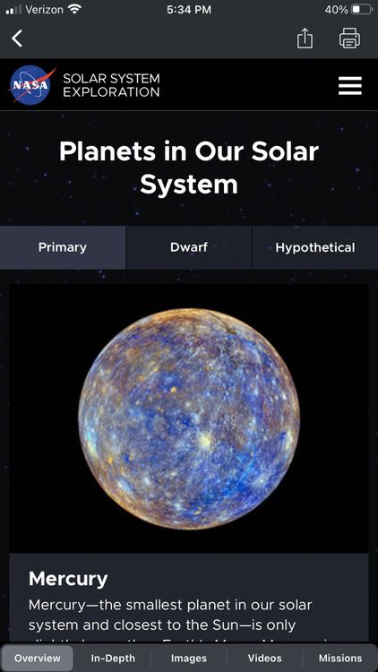
Focused on the planet page
I used the planets page as the main focus to demonstrate the app functionality in 3 levels:
1. Planet landing page provides a list of all planets
2. Planet home page gives a brief insight into basic statistics about a particular planet
3. More info tab provides a detailed description of the planet


Iterations
A card based system was a logical way to present the information and to keep a consistent design language with the dynamic content such as the news or live videos.
Presenting the content in a meaningful way
- The home page acts as a dashboard that prioritizes the most frequently updated sections.
- On the NASA app, there was an interactive solar system. I thought that idea would compliment a list of the planets too.
- An icon is the first interaction a user has with an app. Making the design simple enough while retaining the NASA branding was the initial goal.


Final Outcome
The vision of NASA is to "reach new heights and reveal the unknown for the benefit of mankind." As a result, I redesigned the NASA mobile app with the goal of making the content a visual extension of what they stand for. This was achieved by making the content readily accessible with a card based system and a streamlined navigation system.


